Smartphones can answer our spontaneous questions immediately by connecting us to the internet. You might be looking for directions in a new town or at the grocery store wondering what the last ingredient is that you are forgetting. Mobile devices can help you connect to the information that you need.
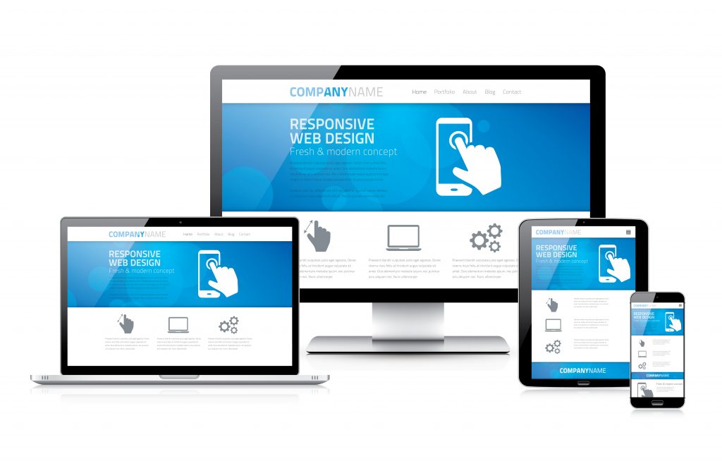
The rise of smartphones and tablets has created a need to tailor our websites to work on a diverse range of devices. Since 2010, designers have been using responsive design to create websites that look and work great on both big and small screens. The trick for small screens is to condense content and create a user-friendly interface. The website “responds” to the type and size of device that the visitor is using.
Responsive design has been around for a while now, but it’s easy to forget that it’s about more than just making a website look good on a tiny screen. Here are a few factors to consider when planning a responsive project:
Your Responsive Design Website
Content that Converts
Your website was probably built to increase your business’ conversions. Mobile website should target the content that converts. For example, the “Sign Up”, “Email” or “Get Started” button should remain prominent. Just because you have a smaller screen, does not mean that you now toss the elements. The elements are only being redesigned.
Finger-Friendly Interface
Touch interface can make a website more difficult to use. For example, links may be too small or too close together to easily tap with a fingertip. When brainstorming your website, it is important to work with your developer and figure out accommodations, where users can easily select and zoom pages. Float Design developed an intuitive tri-bar toggle menu. The responsive menu includes a king size menu bar which can be tapped on any area to allow a selection. Float Design recognizes that users require wide menu bars to select their desired item easily.
Condensing the Design
With a condensed screen comes condensed content. Sure, your desktop website may be beautiful but that does not mean that it will flatter a mobile device. Condensing your content can involve altering the navigation to a drop down, changing “Search” to “Go!”, or using a different image. Ignoring any of these factors can lead to major design flaws that might not be immediately noticed, such as overlapping text
Functional Navigation
You may have the most amazing content on the internet but if your navigation sucks than no one is going to read a word! A great navigation system makes maneuvering your website easy and fast. So how do you create great navigation?
Developers often create sidebars or drop downs. The design varies from the amount of menu items. Nevertheless, your menu must be easy to tap and find. A user-friendly navigation system can lower your bounce rate and increase conversions.
Create a Flexible Future
Websites innovate with new technology and designs should be flexible. Before designing your website, have a clear vision of the site’s purpose and be prepared to reinvent what you have. The first step to developing a flexible website is creating a clear vision of your website’s purpose. We can’t plan for what is ahead but we can confidently approach any new developments. Examples of recent advances in website development for mobile devices is voice control, 3D screens and in-built projectors.
Responsive Design for Your Business
Mobile devices are no longer an emerging trend to access the internet but prominent devices. 80% of internet users own a Smartphone. Responsive design accommodates Smartphone users, delivering websites that are legible. Creating responsive design websites does not have to be scary! Developers have become savvy with creating responsive websites. The weakness on many companies is not creating a purpose before beginning the design. Your website has much more potential for long-term success by determining your goal during the planning period. Responsive design can fine-tune your user-experience to meet the need of you audience on mobile devices.